Introduction
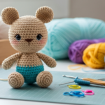
You’ve chosen the perfect pattern—a cozy sweater, a delicate shawl, or a bold granny blanket. You’re excited, hook or needles in hand… until you walk into the yarn aisle and freeze. Dozens of colors swirl before you: deep forest greens, buttery yellows, moody taupes, vibrant corals. Suddenly, your dream project feels overwhelming. What if I pick the wrong combo? What if it clashes? What if it looks dated in six months?
Sound familiar? You’re not alone. Color choice is one of the most powerful—and intimidating—parts of any fiber project. A well-chosen palette can elevate simple stitches into art; a mismatched one can leave even the most intricate pattern feeling “off.”
The good news? You don’t need a design degree to pick stunning yarn colors. With a few guiding principles, a little observation, and some playful experimentation, any crafter can build confident, cohesive, and expressive color palettes—whether you’re making a baby blanket, a market bag, or a statement cardigan.
In this guide, we’ll walk you through a practical, stress-free approach to selecting the perfect yarn color palette. You’ll learn how to use nature, fashion, and even your own home for inspiration, understand basic color theory without jargon, and discover foolproof formulas that always work. By the end, you’ll feel empowered to choose colors that reflect your style—and make your projects shine.
1. Start with Purpose: Who Is It For, and Where Will It Live?
Before you even look at yarn, ask yourself: What is this project for?
A baby blanket needs soft, soothing hues that photograph well and suit any nursery. A winter scarf for your adventurous teen might call for bold, energetic colors. A living room throw should complement your couch—not fight it.
Consider these key questions:
- Who is the recipient? (Yourself? A gift? A charity donation?)
- What’s the setting? (Will it be worn, displayed, or used daily?)
- What mood do you want to create? (Calm? Joyful? Sophisticated? Playful?)
Real-life example: Maya wanted to crochet a shawl for her mother’s 60th birthday. She knew her mom loved neutrals but also adored garden flowers. So she chose a base of warm oatmeal with subtle speckles of sage green and dusty rose—elegant, personal, and timeless.
Pro tip: Take a photo of the room or person you’re designing for. Pull up that image on your phone while yarn shopping—it’s an instant mood board.
This “purpose-first” mindset keeps your palette intentional, not impulsive.
2. Learn the Basics of Color Harmony (Without the Jargon)
You don’t need to memorize the color wheel—but knowing three simple harmony rules will instantly improve your choices:
A. Monochromatic: One Color, Many Tones
Use varying shades of a single hue (e.g., light sky blue, medium denim, deep navy).
✅ Perfect for: Elegant garments, gender-neutral baby items, minimalist decor.
💡 Tip: Add texture (like cables or lace) to keep it from feeling flat.
B. Analogous: Neighbors on the Wheel
Choose 2–3 colors next to each other (e.g., yellow, lime green, teal).
✅ Perfect for: Nature-inspired projects, gentle gradients, soothing blankets.
💡 Tip: Let one color dominate (60%), a second support (30%), and the third accent (10%).
C. Complementary: Opposites That Pop
Pair colors across from each other (e.g., coral + teal, plum + mustard).
✅ Perfect for: Statement pieces, market bags, playful accessories.
💡 Tip: Mute one color (use dusty rose instead of hot pink) to avoid visual “shouting.”
Bonus: Avoid using pure black with brights—it can overpower. Try deep charcoal, navy, or espresso instead.
These formulas work because they mimic natural harmony—think sunset skies (analogous) or flower petals against green leaves (complementary). Trust nature; it’s the original designer.
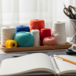
3. Use Real-World Inspiration (Not Just the Yarn Aisle)
Some of the best palettes come from outside the craft store. Train yourself to spot color combos in everyday life:
- Nature: A walk in the woods reveals moss green, bark brown, and mushroom gray. Beach pebbles offer slate blue, sand, and rust.
- Fashion: Notice how your favorite sweater layers neutrals with one accent color. Or how a scarf ties together a whole outfit.
- Home Décor: Pull colors from a rug, pillow, or artwork. Even a coffee mug can spark an idea!
- Photos: Save images on your phone that “feel right”—a moody landscape, a vintage poster, a fruit bowl.
Try this exercise: Next time you’re out, take a photo of a color combo you love. Later, match those tones to yarns. Apps like Pinterest’s color extractor or Adobe Color can help identify dominant hues.
Why it works: These palettes already “live” in the real world—they’re tested by time, light, and human eyes. You’re not guessing; you’re curating.
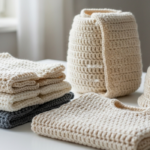
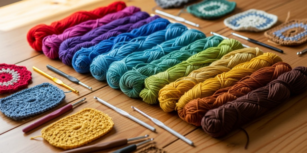
4. Understand Yarn Dye Types—They Affect How Colors Blend
Not all yarns behave the same way with color. The dye method dramatically changes how your palette reads:
- Solid Dyed: One consistent color.
→ Best for: Clean lines, stitch definition, and precise color blocking. - Semi-Solid or Tonal: Subtle shifts in lightness/darkness within one hue.
→ Best for: Depth without distraction—ideal for sweaters or shawls. - Variegated: Multiple colors in a repeating sequence (e.g., stripes of red, orange, yellow).
→ Best for: Simple stitch patterns (like single crochet or garter stitch). Avoid complex lace—it can muddy the design. - Speckled or Hand-Dyed: Random bursts of color on a base.
→ Best for: Adding whimsy. Pair with a solid or tonal to balance the chaos.
Critical tip: When mixing yarn types, let one be the star.
Example: Pair a speckled yarn with a tonal—not another variegated. Too much “busy” overwhelms the eye.
Also, buy all your yarn at once. Dye lots vary, and you don’t want your perfect palette ruined by a slightly off green in the last skein.
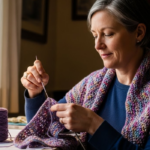
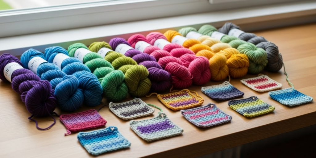
5. Test Before You Commit: Make a Mini Swatch
Never skip the swatch—not just for gauge, but for color testing.
Wind a small sample of each chosen color around a cardboard piece or crochet a 4″x4″ square using your actual stitch pattern. Then:
- View it in natural daylight (colors shift under artificial light).
- Hold it near your skin or against your intended backdrop (a sofa, a shirt, etc.).
- Take a photo—sometimes the camera reveals clashes your eye misses.
Pro move: If you’re using multiple colors, work a few rows of your pattern in sequence. See how they flow. Does the transition feel smooth? Jarring? Restful?
Real benefit: A 10-minute swatch can save you 20 hours of unraveling a $50 project that “just doesn’t work.”
Remember: yarn colors look different in the skein vs. in fabric. Only a swatch shows the truth.
6. Trust Your Gut—But Balance It with Restraint

Here’s the secret no one tells you: you already have good color instincts. If a combo makes you smile, it’s probably right.
But enthusiasm can lead to overcomplication. It’s tempting to use five colors “because they’re all beautiful!”—but too many hues create visual noise.
Guideline:
- Simple projects (dishcloths, beanies): 1–2 colors.
- Intermediate (afghans, sweaters): 2–3 colors.
- Bold statements (art quilts, wall hangings): 3–4 colors max.
Ask yourself: “What’s the one thing I want people to notice?” Let that guide your palette.
Also, embrace neutrals as connectors. Cream, gray, or soft brown can tie together vibrant colors without dulling them. Think of them as the “breathing room” in your design.
Finally, remember: there are no “wrong” colors—only mismatched intentions. If your goal is joyful chaos, go wild! If it’s serene elegance, edit ruthlessly. Clarity beats perfection every time.
Color as Self-Expression: Your Palette, Your Story
Choosing yarn colors isn’t just technical—it’s deeply personal. The hues you’re drawn to reflect your mood, memories, and identity. Maybe you love mustard because it reminds you of autumn hikes. Or you choose ocean blues because they calm your mind.
When you honor that intuition—paired with a little strategy—your projects become more than objects. They become woven stories, full of feeling and intention.
Conclusion
Picking the perfect yarn color palette doesn’t require magic—it just takes a blend of purpose, observation, and simple harmony principles. Start by asking who the project is for and where it will live. Use real-world inspiration and proven color formulas like monochromatic or analogous schemes. Understand how yarn dye types affect the final look, always test with a swatch, and balance your instincts with thoughtful restraint.
Most importantly, give yourself permission to experiment. Buy a few extra mini-skeins, play with combinations on your coffee table, and remember: even “mistakes” teach you what you truly love.
So next time you’re overwhelmed by color choices, take a breath. Look out the window. Think about the person who’ll wear or use your creation. Then trust that you already know the right answer—it’s just waiting to be stitched into life.
We’d love to hear from you! What’s your favorite color combo to work with? Have you ever been surprised by how a palette turned out? Share your photos or stories in the comments below—and if this guide helped you choose colors with confidence, pass it on to a fellow maker who’s standing frozen in the yarn aisle. Happy creating!

Sophia Williams is a crochet enthusiast who found in yarn and hooks a creative way to express calm, patience, and love for handmade art. Focused on the crochet niche, she shares her experience, techniques, and inspiration with those who want to learn, relax, and create meaningful pieces stitch by stitch.